Have you ever visited a website and then immediately, “Wow, this site looks amazing!”? I’m quite sure that a great web design can turn a casual visit into a memorable experience.
If you are building your own website, finding a great design will be crucial. I used to take plenty of time to browse and find inspiring website designs.
And in this post, I will share them with you. They are the top 19 of the best website design examples I’ve seen lately.
I’ll also break down why they are so good. Jump into my list right now and see which one is your favorite!
Contents
- 1 5 Qualities Of A Great Website Design
- 2 Collection of Top 15+ Website Designs In 2025
- 2.1 1. AARK Collective
- 2.2 2. Appart Agency
- 2.3 3. Beauvoir
- 2.4 4. Breakfast
- 2.5 5. Critical Danger
- 2.6 6. Cure Nails
- 2.7 7. Darc Room
- 2.8 8. Elva
- 2.9 9. Foundry
- 2.10 10. Magic John’s
- 2.11 11. Mbau
- 2.12 12. Motion
- 2.13 13. Okalpha
- 2.14 14. Outreach Space
- 2.15 15. Rick Waalders
- 2.16 16. Roee Ben Yehuda
- 2.17 17. Supima
- 2.18 18. Studio Job
- 2.19 19. Swab the World
- 3 Last Words
- 4 FAQs
5 Qualities Of A Great Website Design
Web design is not only about catching appearance, it’s also about functionality. Below are 5 qualities I always focus on while building a website or searching for an excellent one:
- Purpose-Driven Design: All elements on the page, such as buttons and fonts, should support your site’s goal.
- Brand Identity: A well-designed website must embody your brand. The fonts, colors, and images should consistently express your style.
- User-friendly Design: No one likes a disorganized and confusing website, right? So, you must ensure simple navigation, clear layouts, as well as fast load times.
- Engaging Content: Keep things interesting and easy to read. Smart use of white space makes a big difference, too.
- Multi-device Access: Your site should look and work perfectly on various devices, like PCs, tablets, and smartphones.
An eye-catching website will help a lot, especially when you need one to promote affiliate products. And if you’re ever stuck, I suggest looking at award-winning websites for inspiration.
You can also experiment with website builders like Hostinger’s AI-powered platform. It is surprisingly easy to use and doesn’t require any programming knowledge!
Collection of Top 15+ Website Designs In 2025
Let me say this before we get started: I’ve spent hours looking through some of the most creative and best website designs available. Trust me, these designs are next-level. Let’s begin!
1. AARK Collective

- Created By: WordPress content management system (CMS) & WooCommerce
- Category: Accessories
- Style: Geometric Shapes
I’m a big fan of how AARK Collective plays with design. This website makes excellent use of geometric shapes; everything feels clear and intentional thanks to balanced layouts and precise angles. The gentle pastel color scheme brings a calm and modern vibe when scrolling.
One thing I truly love about AARK Collective is the full-scrolling hero image. It draws your eyes the second you land on the page. It’s bold, and elegant, and sets the perfect tone for the rest of the site. Plus, browsing and shopping are quite easy because their product photos are front and center.
2. Appart Agency
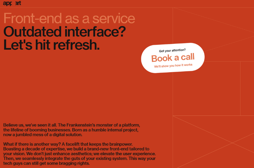
- Created By: Drag-and-drop website builder
- Category: Creative
- Style: Fine Line Art
I have to say, Appart Agency knows how to turn a website into a piece of digital art. I was immediately impressed by the use of fine line art all over the website. It is neat, well-designed, and gives each page you browse a touch of elegance.
The coolest part is the interactive line art on the homepage. You know, it looks like you are playing around when you move your cursor. It’s really a smart way to show their creative skills.
Additionally, their color scheme is flawless. The entire browsing experience is seamless and enjoyable because everything feels cohesive and on-brand.
While the horizontal scrolling effect offers a distinctive, fashionable twist you don’t see every day, the grid system with simple animations keeps everything neat.
3. Beauvoir
- Created By: WordPress CMS
- Category: Creative
- Style: Experimental Navigation
Beauvoir is the ideal example for everyone who likes websites that break the rules in all the right ways.
You will be immediately drawn in by the hero video background that appears at the beginning. It makes you want to stay since it feels daring and contemporary.
The horizontal scrolling navigation of Beauvoir is what really sets it apart. To explore the content, you will move left and right rather than up and down as usual. It’s a refreshing twist that makes browsing feel fun and different.
Plus, Beauvoir uses scroll-triggered animations to maintain a lively and captivating experience as you navigate the pages.
Their clever use of both vertical and horizontal type results in a visually appealing and imaginative website without feeling overpowering.
4. Breakfast

- Created By: WordPress CMS
- Category: Creative
- Style: Art Deco + Nostalgic Interactive
Breakfast is a place you must visit if you enjoy playful and somewhat nostalgic websites. This creative firm creates a look that is both recognizable and novel by fusing current design with old charm.
Everything has a refined, elegant edge based on Art Deco design. However, what really makes it shine is the fun, interactive homepage.
I found it very interesting to click and drag a sunny-side-up egg to change the sky from day to night. It’s simple, clever, and super memorable.
Breakfast is also stunning with its brilliant colors, animated features, horizontal scrolling portfolio, and silky gradients. All of these make the website both visually appealing and fun to explore.
5. Critical Danger
- Created By: Drag-and-drop website builder
- Category: Animal Welfare
- Style: Bold Typography + Motion Graphics
Critical Danger strikes the ideal balance between bold creativity and seamless usability. That is exactly what impresses me about websites.
Everything on Critical Danger is clear and easy to follow thanks to the strong and clean typography. However, the designers didn’t stop with attractive fonts.
The addition of scrolling effects and motion visuals gives the entire experience a sense of life without being overdone.
From the smooth effects to the slick animations, everything moves with ease. It’s engaging, thoughtful, and honestly raises the bar for what a nonprofit website can look like.
6. Cure Nails
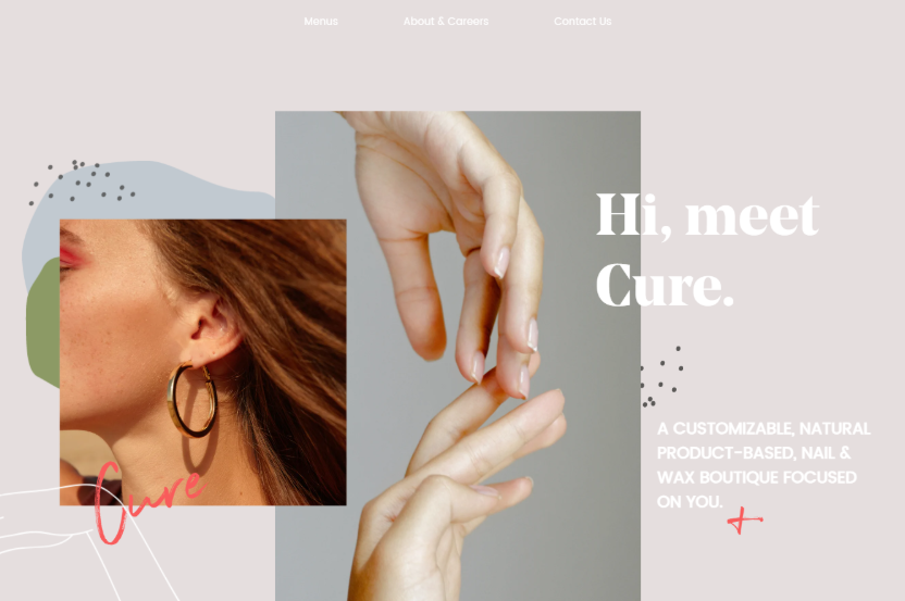
- Created By: Contentful and Nuxt.js static site generator (SSG), CMS, web server & web framework
- Category: Beauty & Lifestyle
- Style: Modern Minimal + Subtle Animations
Cure Nails does a fantastic job of creating a website that is both stylish and simple to use.
The site is super impressive with the striking hero image and engaging phrase on the homepage. It makes you keep scrolling to discover what else they have in place.
As you explore, you’ll notice beautiful animations and subtle parallax scrolling. These effects provide just the right touch of movement while keeping the layout clear and uncomplicated.
Everything seems effortless, contemporary, and modern. You can say that Cure Nails is the perfect balance of fashion and utility.
7. Darc Room

- Created By: Next.js SSG, CMS, web framework & web server
- Category: Photography Portfolio
- Style: Minimal Experimental + Interactive Animation
Darc Room is a must-see for everyone interested in bold, imaginative web design. This is the personal online space of photographer Darko Pašalić, and it’s nothing like your typical portfolio site.
When you land on the homepage, his featured works move around the screen in an interactive spinning menu and greet you.
The other choices disappear when you hover over a category, emphasizing the one you have selected. It’s playful, and clever, and makes you want to click through everything.
Another feature I love about Darc Room is the dark mode and light mode toggle. This gives visitors complete control over how they view the website.
Thoughtful typography and sleek animations – everything makes each of your visits feel like a little visual adventure.
8. Elva

- Created By: Custom-built
- Category: Creative
- Style: Kinetic Typography + Geometric Minimalism
You should take a look at Elva if you love a contemporary, creative yet simple site design. Everything seems purposeful and new.
The homepage’s hero section’s dynamic typography immediately draws the viewer in. The animated text adds a dynamic, alive feel to the page and moves with purpose.
To maintain a clean and well-organized layout, Elva also prioritizes geometric shapes and clear lines. I love how the minimal design lets the content breathe while the subtle animations add just enough movement to keep things interesting. It’s slick, simple to use, and a perfect illustration of the maxim “less is more.”
9. Foundry
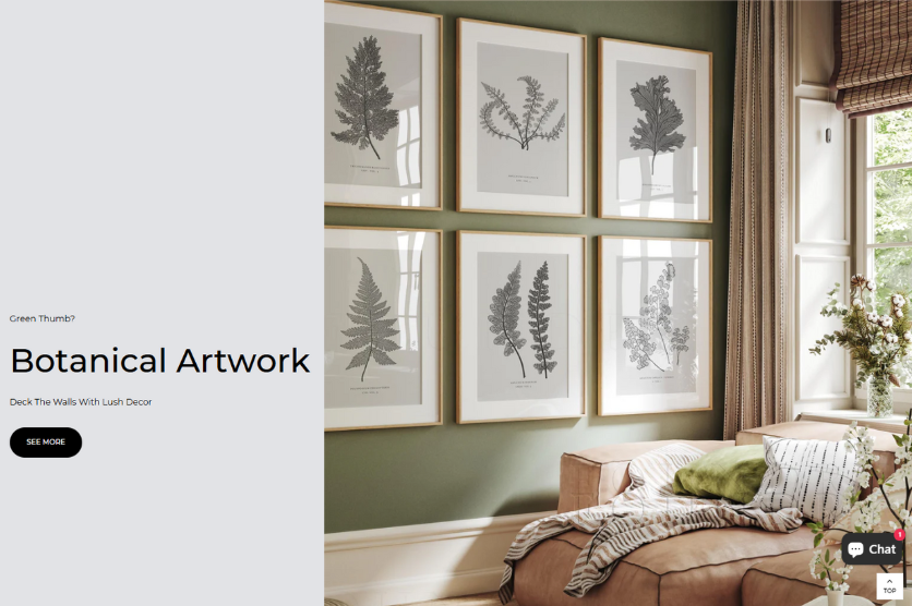
- Created By: eCommerce platform
- Category: Art
- Style: Minimalist + Flat Design
Foundry is a wonderful model to follow if you value simple, uncomplicated websites. This e-commerce website for wall décor masters the art of minimalist design.
It utilizes a soothing black, white, and gray color scheme with an abundance of negative space. It keeps things straightforward so that the product photos and text can be highlighted.
I also like the way Foundry keeps everything neat and organized with a grid style. It’s all well-balanced and simple to follow.
The website is ultra-modern and easy to navigate thanks to its emphasis on flat design, which eliminates frills and shadows.
10. Magic John’s

- Created By: Drag-and-drop website builder
- Category: Food & Dining
- Style: Nostalgic + Playful
I adore Magic John’s because it feels like a charming, tiny pizzeria from the past. The website has a vintage, homey feel thanks to its soft red color scheme, playful fonts, and gentle grainy background effect.
The smart use of a monochromatic palette makes the food, especially the pizzas, pop off the screen. I appreciate how the sticky header makes it simple to navigate throughout the website, no matter where you are on the site.
11. Mbau
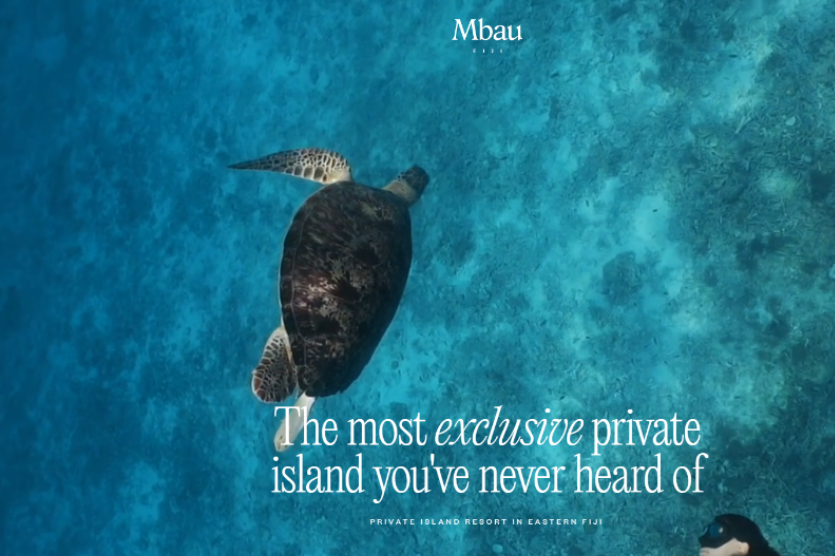
- Created By: Drag-and-drop website builder
- Category: Travel & Tourism
- Style: Immersive + Elegant
The Mbau site pulls you to paradise if you’re daydreaming about a tropical getaway. It begins with a gorgeous hero video.
Believe me, it is difficult to take your eyes off the stunning luxury island resort in Eastern Fiji.
The site’s speed, especially while several movies are playing, is what impresses me. Moreover, Mbau looks great on all screens without weird layout shifts.
Thus, it’s no surprise that Mbau earned the Website of the Month by CSS Design Awards.
12. Motion
- Created By: Drag-and-drop website builder
- Category: Creative
- Style: Playful + Interactive
Motion is not just a website – it feels like a miniature adventure. A small white dot serves as your guide from the beginning, guiding you through bold, dynamic content and lively sounds.
What I love is how Motion balances fun with function. The website is straightforward to use, even though it feels like a game.
It’s a fantastic illustration of how to use basic CSS techniques to produce something memorable without compromising user experience. A triumph of creativity that makes site browsing very enjoyable.
13. Okalpha

- Created By: Drag-and-drop website builder
- Category: Creative
- Style: Minimalist + Bold Primary Colors
Although the site is clean and simple, it is not boring at all. I was immediately impressed by its striking red, blue, and yellow color scheme. These colors pop right off the screen, giving the site a lively, energetic vibe.
Smooth animations help guide your focus without over-complicating the experience. The typography is clear and easy to read, while the smart layout makes navigating a breeze.
If you like to create a design that looks similar to Okalpha, you can use the AI website designer tool of Hostinger.
14. Outreach Space
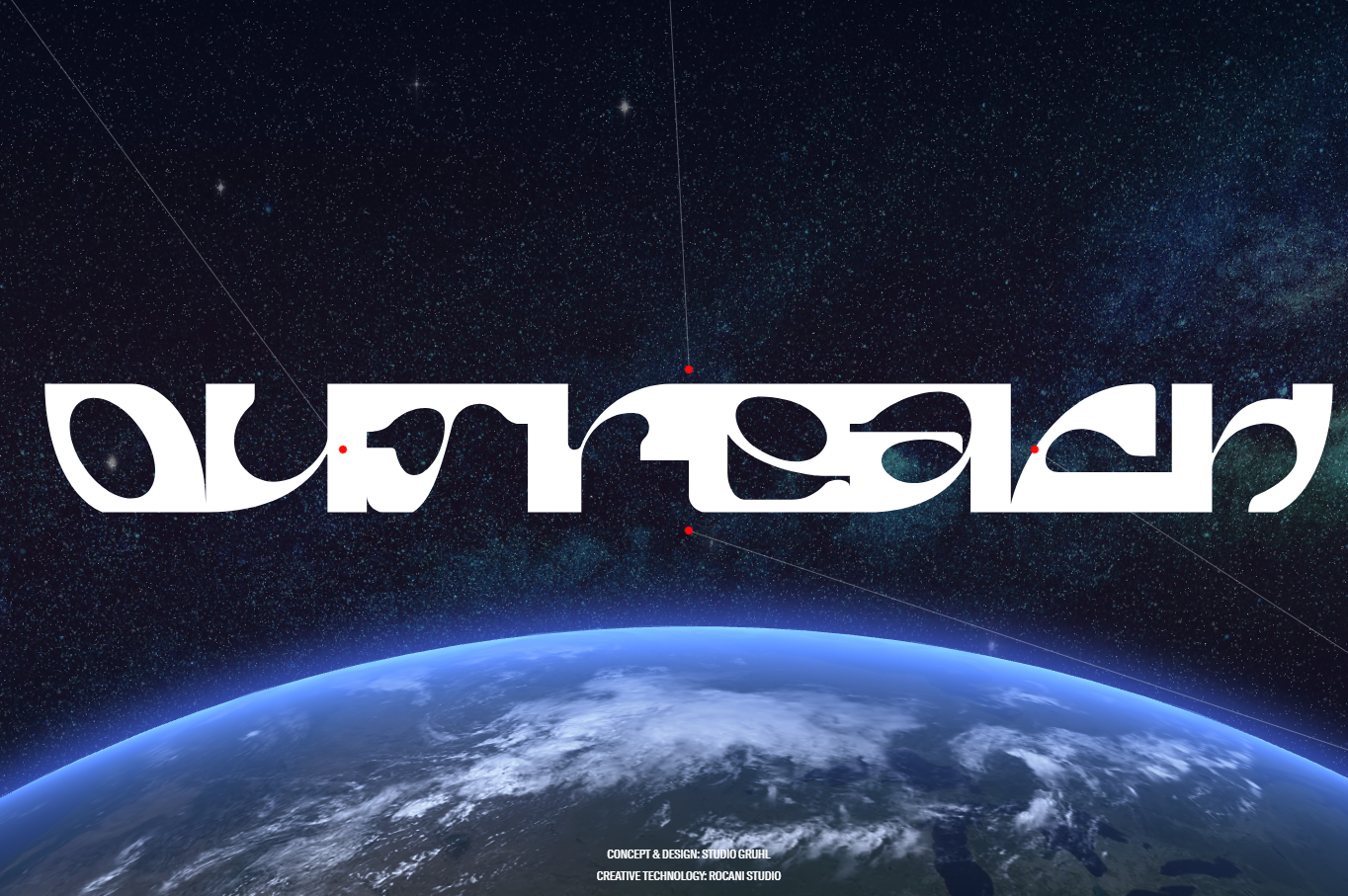
- Created By: Next.js SSG, CMS, web framework & web server
- Category: Education
- Style: Futuristic + Parallax Scrolling
Outreach Space’s sci-fi flair and futuristic feel elevate contemporary web design to a new level. A top-notch hero animation and elegant typography immediately draw your eye and establish the mood on the homepage.
I really admire the use of parallax scrolling. This creates a fascinating, layered appearance as you navigate the website. The blend of color gradients and artistic visuals makes every scroll feel like a little discovery. Moreover, Outreach Space delivers a smooth, seamless experience on any screen size.
15. Rick Waalders
- Created By: Next.js SSG, CMS, web framework & web server
- Category: Design Portfolio
- Style: Bold Typography + 3D Elements
I adore how Rick Waalders creates a gorgeous portfolio website with bold writing and 3D images. It is tidy, modern, and full of personality. The use of big, eye-catching fonts draws your attention right away, and the 3D components give it depth and a high-end vibe.
For me, what makes the site stand out is how Rick merges creativity with technology. He creates a smooth, dynamic experience without going overboard by using JavaScript/React and Cinema 4D.
Suggested Reading
If you want to create a site with ease, consider utilizing AI tools. They can help you build a website much more easily and quickly. Hostinger AI Website Builder is an excellent option I recommend. Besides, chatGPT and AI image generators (like DALL-E and Midjourney) are some powerful tools and services you can’t miss.
16. Roee Ben Yehuda
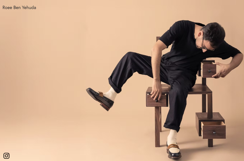
- Created By: Drag-and-drop website builder
- Category: Art & Home Decor
- Style: Experimental Navigation + Cinemagraphs
I’m really impressed with how Roee Ben Yehuda approaches web design with fresh and creative ideas. Instead of the standard menu, he locates navigation options in the 4 corners of the screen. This makes the website feel unique and enjoyable.
The usage of cinemagraphs will also catch the eyes of any visitor. These subtle moving pictures breathe life into the product displays without overpowering the simple, minimalist design. The combination of vertical and horizontal types adds flair and keeps the visuals interesting.
Additionally, Roee cleverly presents various collections side by side in some areas by using a split-screen style. It’s an easy yet powerful way to display content and maintain user interest.
17. Supima
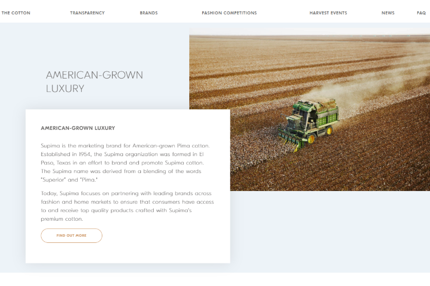
- Made By: WordPress CMS
- Category: Fashion & Apparel
- Style: Minimalist + Pastel Aesthetic
Supima is a stunning illustration of how simple web design need not always be black and white. The combination of soft pastel tones and negative space provides an airy aesthetic and sophisticated vibes for the site. When I first visited Supima, a gorgeous hero image on the homepage attracted me right away.
Moreover, this web design is not only eye-catching but also very functional. The clean, intuitive layout makes navigation effortless, and thoughtfully positioned call-to-action (CTA) buttons guide users naturally through the site.
18. Studio Job
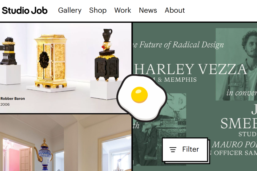
- Made By: Express web framework and web server
- Category: Creative
- Style: Brutalist
I love how Studio Job dares to be different with its brutalist web design. Yep – bold text, high-contrast color scheme, and odd, broken grids – all of them create a raw and artsy vibe that you won’t forget soon.
The endless scrolling feature is one thing that I think is really awesome. No click-through pages, just seamless and non-stop exploration. It keeps you interested in what’s coming next and makes browsing feel effortless.
Overall, this website perfectly reflects Studio Job’s fearless, creative spirit. It’s bold, it’s loud, and honestly, it’s a lot of fun to experience.
19. Swab the World
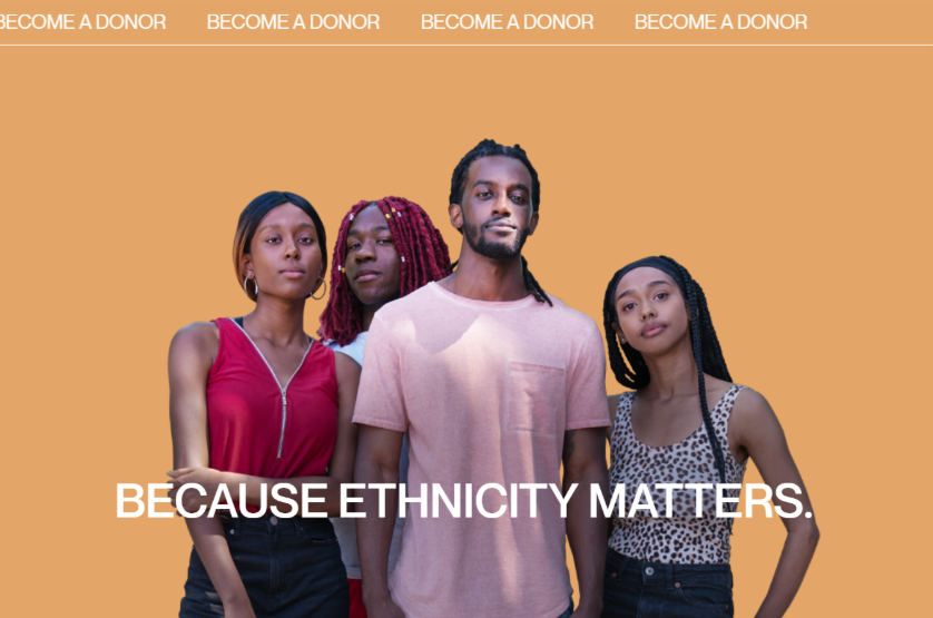
- Made by: Craft CMS & Yii web framework
- Category: Health & Wellness
- Style: Motion Graphics & Geometry Design
Swab the World stands out with clean geometry designs and motion images. This brings a fresh, modern, and extremely captivating vibe.
The split-screen layout is what drew my eyes the most. It’s a really clever technique to display multiple pieces of content simultaneously while maintaining ease of use.
The site’s animations are fluid and lead you through it naturally without being overbearing. This is an excellent example to check out if you’re looking for a dynamic and user-friendly site design!
Pro Tip
If you are building a charity website like Swab the World, you can explore stunning nonprofit website templates provided by Hostinger.
Last Words
There you have it: a collection of breathtaking, imaginative websites that truly push the limits of online design. I truly appreciate how each website aims to give users meaningful, lasting experiences in addition to aesthetics.
If you’re considering creating your own website, why not borrow one of these best website design ideas? A little creativity will bring benefits in the long run, I promise. Thanks for reading, and I hope today inspired you in some way!
FAQs
How Much Does It Cost For A High-Quality Website Design?
It depends on several factors. A unique, high-end design could cost anywhere from $3,000 to $10,000 or more, while a basic website might start at $500 to $2,000. Fortunately, you can save quite a lot by using a website builder with a drag-and-drop editor. Initial charges can range from $12 to $60.
What Should Be Included In My Website Design?
Your website should have at least a clear navigation menu, a standout hero section, a consistent color scheme, and good images or videos. I also suggest good typography, clear navigation, responsive design, and CTA buttons. If you are running an e-commerce site, you will need the shopping cart, checkout, and product pages.
How Long Does It Take to Build a Website?
It may take a few days to several months, depending on its size and complexity. A custom project with animations and unique features could take 2-3 months to complete, while a basic website could be finished in 1-2 weeks.